Showing posts with label Growth Investing. Show all posts

Sunday, October 8, 2017

A Look at Stock Rover

Stock Rover is as close to an all-in-one stop for stock information that I have seen. It has 2 separate sections that I refer to as the "Market" section and the "Stock Rover App" section. Both of these sections have a vast amount of useful underlying research information on the various stocks that make up the tradable stocks on the exchange. I will not be able to detail all of what you will find on this site. Just highlighting the areas that I find interesting will make for a long enough post. I can't stress enough that there is a ton of information under each tab and many more when hovering over some items or right clicking things like symbols.

You must register with Stock Rover. The registering is free and will give you access to everything I am talking about here. Premium membership is $250 per year. I don't think the Premium is necessary for most investors, especially smaller investors trying to learn. If you want to though they do have a 14 day free trial that you activate from the Stock Rover app menu with no credit card information required for the free trial. If you don't upgrade in the 14 days the app returns to the "free" version. Do not take this as an advertisement or recommendation, I have no affiliation and get no benefit from anyone subscribing.

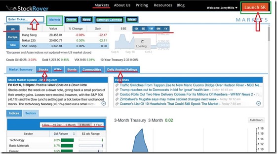
Image 1 below is the main Markets page. I've highlighted a few things on here. Black menu bar at top is main sections and this shot is on Markets. On the Market section there is a lot to see. Notice the first set of tabs. It also is on Markets showing the performance of the overall indexes. Note that you can change the time frame to get up to one year performance. This tab also provides a lower table which is currently on Market Summary showing yet another table below that which is currently on Sectors. You can also change the time frame on sectors to get various views on strong sectors for whatever period you select. If you trade on the uptrends you want to use this to find which sectors are the best then drilling down into them to see what stocks are strong.

Notice the tabs along this table. In addition to Market Summary you have a Stocks, ETFs, Bonds, Commodities and Daily Analyst Ratings. Each of them has a summary for that day. Stock tab will show the largest movers for the day and top performers and top losers. Also note, the daily analyst tab shows companies that have been upgraded or downgraded for that day.

Image 1
clip_image002

Image 2 shows the screen that you get when staying on the Markets section (top black menu) but moving the first table down to "Quotes". Here, if you have no tickers entered you need to have one. This shot is looking at Oracle (ORCL). Note the table right under that is currently on Financials but you have a Details, Chart, News, and Peers in addition. I just wanted to highlight the Financials so you could see the fundamental data available here. By clicking the + mark in each line reveals the data for that item. It is currently on Financial Health. Note the data and graphs. On the left side if you click on the existing "X" it will remove that item from the graph. Clicking on the graph icon will add the item. You can have up to 4 items in the graph.

Image 2

clip_image004

In Image 3 we again stay in the Markets section (Black menu bar at top) but in the first table we clicked on "Ideas". Stock Rover keeps a few "featured screeners" to run without having to go into the Stock Rover app (image 4 below) I just want to point out that in the image below sitting just below the list of screened stocks is "Other Featured Screeners" Click on one of them for a different type of screen. The active screen shows the details of what is being screened to the left of the list of stocks. Also not you can access he CNBC Video Feed (Lower Right of Image 3)

Image 3

clip_image006

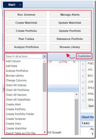
Lastly is Image 4 below which is the Stock Rover App. If you look on the images above it is located on the black menu bar at the top on the far right. Click the orange button "Launch SR" and it should open this up in a new tab or window depending on how you have your browser setting. This has just as many different places to explore as the "Markets" page so I won't try to get into too much detail here. I just want to highlight a few things. See the Start button (upper left of image 4)? Clicking that down arrow brings up a menu shown in Image 5 below. Look over the sections on this page. On the left side is the Market Summary, Quotes and Navigation. You simply have to click on the areas that I have highlighted in the Navigation section to see how really intensive this section is. As you highlight any of the stocks in the table in the middle (Research Tickers) It will populate the bottom chart and the right section labeled Insight for (symbol). Notice the grading system I highlighted in that box. Also note the tabs for additional details.

Image 4

clip_image008

Image 5 - Clicking arrow next to "Start" this is under the start menu
clip_image010

So this post just touches on the many features of this well laid out stock research website. I strongly recommend you spend a little time clicking through things here. As you click around in here you will probably come across some of the features only available to premium members but as of now it has not compelled me personally to pay for it. For me, I have another stock screening app that I am presently paying for that runs out in January of next year. At that time I might consider trying the premium. Lastly, below is a few links for more information about Stock Rover.

Compare features of Free vs Premium

https://www.stockrover.com/plans/compare/

Detailed Help for Stock Rover app (not Markets page)

https://www.stockrover.com/how-to/stock-rover-basics/right-click-menus/

17 page Getting Started Guide in PDF format for the Stock Rover app (not Markets page)

https://www.stockrover.com/library/pdf/getting-started-in-stock-rover.pdf

Created with Microsoft OneNote 2016.

Friday, July 15, 2016

What is the Top Down Style of Investing?

The idea behind top down investing is that in the S&P 500 it is divided into sectors and within each sector is a number of industries.  As the economy moves through it’s different cycles between expansion and contraction, certain industries become more attractive than others and they tend to attract more investors (more money flowing) into them.  This tends to make that sector outperform the S&P benchmark while those sectors out of favor will underperform the benchmark. 

image

The screen shot above is from my think or swim platform that allows me to look at the sectors by performance compared to SPY (S&P benchmark) Notice the columns on the right.  This one is sorted by 10 day performance and shows currently (mid July 2016) that Biotech (an industry) is out performing the SPY by about 3% in the past 10 trading days while Utilities (sector) is underperforming SPY by around 2%.  I use 10 day performance for short term trend trades and 3 month for intermediate term trends

The concept I learned is the saying that “a rising tide floats all boats” which means that most stocks within an outperforming industry will outperform the S&P.  This is usually indicated on the charts by an uptrend.  The length of the uptrend to look at depends on the type of investing you are doing.  If you are a short term investor the uptrend does not have to be months long.  If you are an intermediate term investor you want the uptrend to at least show a small rise in the 30 day moving average and pointing up.  It’s not an exact science and this method is only intended to give an investor an “edge” in picking up trending stocks.

So, with that in mind, in order to find stocks that meet top down style we can run a screen.  FinViz at http://finviz.com has a pretty decent free screener.  See the screen shot below.

image

You do not need to register with them to run screens but do need to register to save them.  It is free to register and is well worth the time to do so.  To save a screen after you have set it up, just click the down arrow in “My Presets” (upper left corner) and give it a name.  You can adjust this screen to suit yourself but the ones I use are highlighted in yellow.  I like a stock to be over $1 in price with an analyst recommendation of buy or better.  I also like average volume over 200,000 to insure I can get in and out of a trade quickly.  In order for a growth stock to grow, earnings need to be improving so I look for those that grew earnings by at least 10% this year and projected earnings growth of 10% next year.  Additional test on earnings is improving earnings and sales quarter to quarter.  I like to add the current ratio of over 1.5 because I like to know that a company can cover it’s current liabilities with it’s current assets.   I save this screen setup with the name of “TopDownInvesting(addSector)”  

With this criteria mentioned above, today I am getting 172 results.  But, I’m looking for strong sectors or industries.  So I need to add a criteria in one or both of the items marked in red in the above screenshot.   Materials is one of the strong sectors over the past 10 days so by changing the sector to Basic Materials (screenshot below) I get 7 results.

image

I can easily switch from one sector to the next to get the stronger stocks in any particular industry.  Adjusting any of the criteria up or down will of course change the number of results.  For example, if I changed Current Ratio to “Any”  I would get 13 results.  Any screener you use though is just that.  It’s a screener.  It does not say “buy me”.  You must look at and evaluate each stock before making a decision. 

Thursday, May 26, 2016

Manage Risk with Position Sizing

Position sizing should be part of your overall investment strategy regardless of what style of investing you use.  It is intended to control downside risk.  There are certain rules you should follow but like most things with stock investing you do have to customize the process to fit your personal needs and risk profile..

How much you buy in a single trade—or your position size—is a critical decision. It directly impacts how much you might gain or lose on a trade and is another key part of the risk equation. Position size is influenced by two important concepts: portfolio risk and total amount invested.

Portfolio risk is the target maximum amount of money you’d lose on a single trade if the trade hit your stop, or was “stopped out.”  Most investors with a “Low” appetite for risk should settle in on .5%, moderate risk 1% and aggressive should keep it 2% or less.  If you are just getting started with investing I’d recommend the 1/2 percent level until you get familiar with how the sizing works and impacts your overall portfolio.

Investors also need to consider the total amount invested in any one trade. Consider setting a guideline to allocate no more than 10% of your portfolio to one investment. You may want to scale down if you’re more conservative or new to investing.

To figure this all out you need to determine the Trade Risk of the stock you are ready to purchase.  Trade risk is the stocks purchase price minus the stop price.

Stop Price has no right or wrong answer when calculating.  It is your decision to make at the time of the purchase when you get out of a stock that is turning against you.  One good method is to look at current support levels on the chart and set a stop price.  (Low risk appetite set just below support, average risk about 3% below that and more aggressive set about 5% below support. 

Here’s an example of a stock XYZ selling for 55.69. 

image

Some might see support at 53 while others may call support at 50.50.  Neither is wrong and will end up carrying the same risk in dollars.  The trade risk on the 53 stop is 55.69-53=2.69  while the trade risk on the 50.50 stop is 55.69-50.50=5.19

In the below example, notice that the acceptable risk per transaction is 1000 dollars so with the tighter stop you can purchase 371 shares but need to get out if stock goes down to 53.  Also notice that since you don’t want to exceed 10 percent of the portfolio you need to reduce your purchase from 371 down to 179 to stay under 10,000 dollars.  This also reduces your risk exposure down to 481 dollars if you have to exit at 53.

image

Higher trade risk below equals less shares per max risk (192 vs 371 above) but shares to actually buy remains the same at 179 due to 10% allocation rule.

image

Lastly, Here is a google spreadsheet for you to use to make your own calculations if you decide you like this concept and want to incorporate it into your trading rules.

Google Sheets Position Sizing Calculator

I did put edit rights on this share but if you plan to use it you should save a copy of it to your google sheets for your personal use.

Sunday, November 22, 2015

Learn Fundamental Analysis

Business Finance Online - This site is an interesting learning site in understanding how to evaluate the financial condition of a company and spotting value.  A lot of the things on this site can be obtained at online quote sites but this helps break down how they are calculated plus have some info that cannot be obtained unless you calculate yourself.  Information and calculator pages are simply good and the site is free, no advertising and no registration required. 

Google+