Monday, April 24, 2017

A Couple of Worthy News Sites


In addition to the obvious business news sites that investors seek out for stock information like Google Finance, Yahoo Finance, Reuter’s and Bloomberg, there are also smaller less known sites that offer very good insight into stocks.  Here are two that I like. 

The Wellesleys News

http://thewellesleysnews.com/ 

image

Screen shot above shows the home page.  They update frequently during the day and categorize their stories according to the menu you see in black across the top of the page for Business, Consensus &  Forecast, Sector Snapshot, Trending Equities, and Top Yields.  Each section gives you a list of articles related to that topic.  This is a good place to check on watch list stocks as well as keeping current on the companies in your active portfolio.

The Cerbat Gem

Market News and Analysis

hhttps://www.thecerbatgem.com/category/headlines

image

Screen shot above shows the home screen.  Note the menu across the top just underneath the logo.  That separates articles by category much like Wellesley site.  I especially like the M&A section and Analysts’ Updates.  Both of these sites are worthy of bookmark space.  Another thing these sites are useful for is discovering good companies that may not turn up on other screens that you run to select stocks to research.

Monday, March 27, 2017

3/25/17 Barron’s Picks and Pans

(BZ Newswire) --

This weekend's Barron's takes a look at a long-suffering media company poised for a turnaround.

Other featured articles offer the prospects for a solar power outfit with a strong balance sheet and a lender in a sweet spot of high growth.

The outlooks for a chip maker riding a tailwind and a consumer electronics giant with a respectable dividend yield are also examined.

"Viacom Flips the Script: Stock Has 40% Upside" by Robin Goldwyn Blumenthal makes the case that long-suffering media company Viacom, Inc. (NASDAQ: VIAB) is tracking a new course toward a turnaround. See how a new CEO is shaking things up, shifting priorities and reinvesting in the company. The stock has risen since he took up the reins but still looks cheap, according to Barron's.

In "Dark Clouds May Be Lifting for SolarEdge," Andrew Bary suggests that shares of Solaredge Technologies Inc (NASDAQ: SEDG), which makes optimizers and inverters, could rise by 40 percent or more in the next year. See why Barron's thinks that, with its strong balance sheet, the solar power outfit offers staying power until the industry comes back in vogue.

Jack Willoughby's "Why Silicon Valley Bank's Stock Could Rise 25%" takes a look at whether this lender to venture capitalists and startups is headed into a sweet spot of high growth. Discover why Barron's believes SVB Financial Group (NYSE: SIVB) is poised for several years of rapid earnings growth that dwarfs expectations for most other banks.  

While the growth cycle at Micron Technology, Inc. (NASDAQ: MU) could be extended, it won't last forever, according to "Micron, Up 170%, Could Move Higher. But Be Wary" by Tiernan Ray. The current market conditions for Micron are proving extraordinarily favorable, though the CEO announced his retirement last month and the company has yet to name a successor.

In Johanna Bennett's "Apple iPhone, Dividend Buzz Can Keep Stock Hot," see why one key analysts says that even with Apple Inc. (NASDAQ: AAPL) shares near an all-time high, investors should expect another 20 percent gain. While Apple is trading near its highest price-to-earnings multiple in five years, there is much to like, including a respectable dividend yield.

Keep up with all the latest breaking news and trading ideas by following Benzinga on Twitter.

Sunday, January 15, 2017

Arnold Van Den Berg: "Experiential Wisdom on Value Investing" | Talks at...


Arnold gives a very interesting talk on his experience as a value investor and as the talk goes on he provides some very good information on current status of the Market, how to look at one indicator of market tops and market bottoms as well as 2 areas of opportunity he sees in today's market.  Worth the hour it takes to listen

Monday, October 3, 2016

Market Forecast Study TD Ameritrade

Below is an article copied from TD Ameritrade’s Ticker Tape that is a newsletter added to daily by TD Ameritrade for it’s clients.  It illustrates a very useful study that can be added to your charts in the Think or Swim platform.  Yes, you must have a TD Ameritrade account to make use of this platform.  Although, paper traders can open a TD account and do not have to fund the account (you can have a zero balance) and still download the platform and open it in “Paper Money” and practice trading.  You can add to your learning of how this works in real time by catching David’s daily Market Forecast video on YouTube.  You do not need to have a TD Ameritrade account to view these daily recaps.  Here’s the article:

Market Forecast: Stocks Break Winning Streak with Tight Range

By David Settle, Curriculum Development Manager, Investools

September 9, 2016

After closing higher for five straight months, the S&P 500 finished August with one of its quietest months ever. This is not typical for the last month of the summer where volatility tends to increase.

Last year in August 2015, the S&P 500 suffered a five-day losing streak that totaled 229 points, or a 10.9% drop. In comparison, the broad market index stayed in a 46-point range all month this August, which is roughly just 2% of the index’s current value.

Needless to say, it’s been a quiet August that has investors looking ahead to presidential elections, potential Fed rate hikes, and a favorite football team’s kickoff.

Let’s break down the market posture using the Market Forecast technical indicator.

S&P 500: Calm Before the Storm?

The first thing that jumps out from the S&P 500’s Market Forecast charts (see figure 1) is its elevated Market Sentiment (orange). If you look back over the past year, stocks tended to get choppier when the long-term sentiment indicator rose above the 80th percentile. In fact, notice the intermediate line (green) has already fallen late this month as stocks consolidated in a tight range. Again, you’ll notice periods earlier this year where the intermediate line fluctuated up and down more with Market Sentiment at current levels, rather than maintain a persistent higher position above 80.


FIGURE 1: HIGH MARKET SENTIMENT LEVELS.

High levels in Market Sentiment can lead to more up and down moves in the Intermediate line. Image source: the thinkorswim® platform by TD Ameritrade. For illustrative purposes only. Past performance does not guarantee future results

What Do These Lines Mean?

As you can see in the Market Forecast chart, there are multiple lines that oscillate within the same parameters but at different speeds. This is one of the benefits of using this particular technical indicator. It provides investors with a multi-timeframe look at the same index at the same time, without having to change the chart settings and flip back and forth. Not only does this help you save time, but it also provides a glimpse at how the lines interact with each other. As most of you may be new to the Market Forecast, let’s chat about what some of these lines mean.

The momentum line (red) is the fastest of the four lines. It can fluctuate day to day. Because of this, it typically doesn’t provide good opportunities for divergences or other common technical patterns. But, since its calculations incorporate the relative size of the day’s range compared to previous days, the momentum line does have value when you see extreme spikes higher or lower, especially when these spikes go against the prevailing trend.

The near-term line (blue) is the second short-term sentiment indicator. It can produce new lows between 1-3 weeks apart. You can see how this could be helpful when looking for short-term bounce opportunities. You’ll also notice the near-term line’s lows in bullish trends tend to form above the 20th percentile. And, its peaks form at the higher end of the chart. The opposite is true in bearish trends. This can be helpful when looking for signs that trends may be changing. In fact, the near-term line dropped below the 20th percentile for the first time at the end of August (see figure 2). Its subsequent peak failed to get back to the top of the chart, which confirms the intermediate (green) trend change to bearish for the first time since late June.


FIGURE 2: NEAR-TERM LINE SHOWS WEAKNESS.

The Near-term line has been showing bullish highs and lows over the past two months until the end of August. Image source: the thinkorswim® platform by TD Ameritrade. For illustrative purposes only. Past performance does not guarantee future results.

After five straight months of positive returns, the S&P 500 took a historic breather during August. Over the past few years, stocks have been choppy after the end of summer, before riding a bullish wave into year-end. You can use the Market Forecast technical indicator to help determine a posture for stocks and other asset classes and decide how to position a portfolio accordingly. In upcoming monthly articles, I’ll show you how. In the meantime, check out my daily educational videos on how to apply the Market Forecast by clicking the link below.

Sunday, August 14, 2016

3 Items to look for in a Stock

This is an excerpt from an article on Motley Fool regarding Google stock but the 3 items in the list below are valid and can be used when looking for very strong companies.  I have not worked out a stock screen yet to see if I can incorporate these 3 items into a screen but will be looking to do so.  I especially need to look at item 3 below to better understand what that means.

The Motley Fool | 2016-08-13T18:04:00Z

No book has had a more profound impact on my investing than Nassim Taleb's Anti fragile. It argues that the entire world can be broken into three categories:
  • The Fragile: things that break as soon as stress is applied -- like a glass falling off of a table.
  • The Robust: things that stay absolutely the same under stress -- a rubber ball falling from the same table.
  • The Anti fragile:things that become more powerful when stressors are introduced -- think of how your bone heals back stronger than before after it's broken.
We want our portfolios to be as anti fragile as possible. But we often fail at this. That's largely because we are suckers for the narrative bias: We tell ourselves a story about a company: how its sales will grow and its products will revolutionize the world, and we invest accordingly.
I created a compelling narrative for the first stock I ever wrote about for The Fool six years ago. Since then, that stock has trailed the market by a whopping 172 percentage points!
By viewing the investing world through an "anti fragile" lens, I eliminate the narrative bias by focusing on three attributes:
  1. Lots of cash and lots of customers: cash gives companies options during downturns -- outspending rivals, buying back stock, or acquisitions. Debt does the opposite. And by having lots of customers, a company doesn't run the risk of losing an outsized portion of business if a client walks away.
  2. Management with skin in the game: When the people running the company have their own skin in the game -- via shares of the company's stock -- their long-term interests are aligned with ours. That benefit compounds when founders are running the company, as they often view it as a literal extension of themselves.
  3. A barbell approach:This means having two sides to your strategy -- on one hand you have a business segment that has a wide moat. On the other hand, you take lots of low-probability, low-risk, high-reward bets -- a trait otherwise known as "optionality".

Friday, July 15, 2016

What is the Top Down Style of Investing?

The idea behind top down investing is that in the S&P 500 it is divided into sectors and within each sector is a number of industries.  As the economy moves through it’s different cycles between expansion and contraction, certain industries become more attractive than others and they tend to attract more investors (more money flowing) into them.  This tends to make that sector outperform the S&P benchmark while those sectors out of favor will underperform the benchmark. 

image

The screen shot above is from my think or swim platform that allows me to look at the sectors by performance compared to SPY (S&P benchmark) Notice the columns on the right.  This one is sorted by 10 day performance and shows currently (mid July 2016) that Biotech (an industry) is out performing the SPY by about 3% in the past 10 trading days while Utilities (sector) is underperforming SPY by around 2%.  I use 10 day performance for short term trend trades and 3 month for intermediate term trends

The concept I learned is the saying that “a rising tide floats all boats” which means that most stocks within an outperforming industry will outperform the S&P.  This is usually indicated on the charts by an uptrend.  The length of the uptrend to look at depends on the type of investing you are doing.  If you are a short term investor the uptrend does not have to be months long.  If you are an intermediate term investor you want the uptrend to at least show a small rise in the 30 day moving average and pointing up.  It’s not an exact science and this method is only intended to give an investor an “edge” in picking up trending stocks.

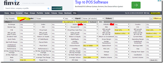
So, with that in mind, in order to find stocks that meet top down style we can run a screen.  FinViz at http://finviz.com has a pretty decent free screener.  See the screen shot below.

image

You do not need to register with them to run screens but do need to register to save them.  It is free to register and is well worth the time to do so.  To save a screen after you have set it up, just click the down arrow in “My Presets” (upper left corner) and give it a name.  You can adjust this screen to suit yourself but the ones I use are highlighted in yellow.  I like a stock to be over $1 in price with an analyst recommendation of buy or better.  I also like average volume over 200,000 to insure I can get in and out of a trade quickly.  In order for a growth stock to grow, earnings need to be improving so I look for those that grew earnings by at least 10% this year and projected earnings growth of 10% next year.  Additional test on earnings is improving earnings and sales quarter to quarter.  I like to add the current ratio of over 1.5 because I like to know that a company can cover it’s current liabilities with it’s current assets.   I save this screen setup with the name of “TopDownInvesting(addSector)”  

With this criteria mentioned above, today I am getting 172 results.  But, I’m looking for strong sectors or industries.  So I need to add a criteria in one or both of the items marked in red in the above screenshot.   Materials is one of the strong sectors over the past 10 days so by changing the sector to Basic Materials (screenshot below) I get 7 results.

image

I can easily switch from one sector to the next to get the stronger stocks in any particular industry.  Adjusting any of the criteria up or down will of course change the number of results.  For example, if I changed Current Ratio to “Any”  I would get 13 results.  Any screener you use though is just that.  It’s a screener.  It does not say “buy me”.  You must look at and evaluate each stock before making a decision. 

Tuesday, June 21, 2016

Economic Cycle and Sector Rotation

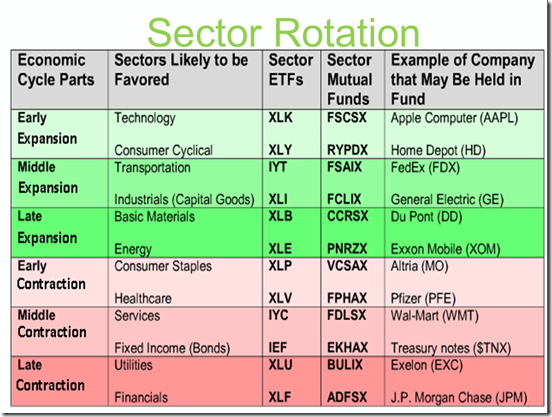
The economic cycle is an important concept to understand when investing in stocks.  It is helpful to know where the overall economy is sitting in order to see what sectors of stocks might be under performing or over performing the S&P benchmark.  It also helps in forming an overall market posture and get prepared for a bear market and/or get back in at the beginning of a bull market.  The younger a person is doing long term investing the less this needs to be a focus.  However, once a person gets 10 to 15 years from retirement this knowledge can become critical in maintaining a nest egg that has been building.  Since an economic cycle can take 7 to 10 years to play out, as you get nearing retirement and can see that a late expansion situation exists, like the one I think we are currently in, then one should pay attention to how aggressive they have allocated their 401K or IRA and take steps to become less aggressive by transferring into safer funds etc.

 

image


image

Last 6 months sector performance as of June 21, 2016

image

Last 3 months sector performance as of June 21, 2016

image

These sectors will never follow a “textbook” looking scenario so one has to make judgements on what you see.  In the 6 month performance even though Utilities (late expansion) show strength, Energy, Materials and Consumer Staples are prominent indicating late expansion to early contraction.  Then in the 3 month performance Utilities has slipped but late expansion to early contraction continue to outperform SPY (S&P benchmark).  This is why I think we are currently in late expansion.  The market has been moving sideways for sometime now and as it moves sideways money has been leaving consumer discretionary and technology sectors and moving into safer consumer staples, energy and utilities.  With the market stalled right now, growth stocks are not getting the fuel they need to drive prices up.  While it might take another year to enter contraction, I think the threat is real because it is the normal flow of the economic cycle.  Below is an explanation of the economic cycle and business cycle and what to look at to help determine where we are.  Hint, the GDP report is very important.

What is the 'Economic Cycle'

The economic cycle is the natural fluctuation of the economy between periods of expansion (growth) and contraction (recession). Factors such as gross domestic product (GDP), interest rates, levels of employment and consumer spending can help to determine the current stage of the economic cycle.

BREAKING DOWN 'Economic Cycle'

An economy is deemed to be in the expansion stage of the economic cycle when gross domestic product (GDP) is rapidly increasing. During times of expansion, investors seek to purchase companies in technology, capital goods and basic energy. During times of contraction, investors will look to purchase companies such as utilities, financials and healthcare .

What is the 'Business Cycle'

The business cycle is the fluctuation in economic activity that an economy experiences over a period of time. A business cycle is basically defined in terms of periods of expansion or recession. During expansions, the economy is growing in real terms (i.e. excluding inflation), as evidenced by increases in indicators like employment, industrial production, sales and personal incomes. During recessions, the economy is contracting, as measured by decreases in the above indicators. Expansion is measured from the trough (or bottom) of the previous business cycle to the peak of the current cycle, while recession is measured from the peak to the trough. In the United States, the National Bureau of Economic Research (NBER) determines the official dates for business cycles.

BREAKING DOWN 'Business Cycle'

According to the NBER, there have been 11 business cycles from 1945 to 2009, with the average length of a cycle lasting about 69 months, or a little less than six years. The average expansion during this period has lasted 58.4 months, while the average contraction has lasted only 11.1 months.

The business cycle can be effectively used to position one’s investment portfolio. For instance, during the early expansion phase, cyclical stocks in sectors such as commodities and technology tend to outperform. In the recession period, the defensive groups like health care, consumer staples and utilities outperform because of their stable cash flows and dividend yields.

As of January 2014, the last expansion was determined to have commenced in June 2009, the period when the Great Recession of 2007-09 reached its trough (technically, that recession began in December 2007).

Expansion is the default mode of the economy, with recessions being much shorter and less common. So why do recessions occur at all? While economists’ views differ on this subject, there is a clear pattern of excessive speculative activity evident in the latter stages of expansion in many business cycles. The 2001 recession was preceded by an absolute mania in dot-com and technology stocks, while the 2007-09 recession followed a period of unprecedented speculation in the U.S. housing market.

The average length of an expansion has increased significantly since the 1990s. The three business cycles from July 1990 to June 2009 had an average expansion phase of 95 months – or almost 8 years – compared with the average recession length of 11 months over this period. While some economists were hopeful that this development marked the end of the business cycle, the 2007-09 put paid to those hopes.

Recessions can extract a tremendous toll on stock markets. Most major equity indexes around the world endured declines of over 50% in the 18-month period of the Great Recession, which was the worst global contraction since the 1930s Depression. Global equities also underwent a significant correction in the 2001 recession, with the Nasdaq Composite among the worst-hit as it plunged almost 80% from its 2001 peak to 2002 low.

What does 'Expansion' mean

Expansion is the phase of the business cycle when the economy moves from a trough to a peak. It is a period when the level of business activity surges and gross domestic product (GDP) expands until it reaches a peak. A period of expansion is also known as an economic recovery.

BREAKING DOWN 'Expansion'

An expansion is one of two basic business cycle phases; the other is contraction. The transition from expansion to contraction is a peak, and the changeover from contraction to expansion is a trough. Expansions last on average about three to four years, but they have been known to last anywhere from 12 months to more than 10 years. Much of the 1960s was a time of expansion, which lasted almost nine years.

Economists and policy makers closely study business cycles. Learning about economic expansion and contraction patterns of the past can help forecast potential trends in the future. Whether cash is available or scarce, interest rates are low or high, and companies and consumers can borrow money to spend on goods and services affects how businesses and consumers react.

What is a 'Contraction'

A contraction is a phase of the business cycle in which the economy as a whole is in decline. More specifically, contraction occurs after the business cycle peaks, but before it becomes a trough. According to most economists, a contraction is said to occur when a country's real GDP has declined for two or more consecutive quarters.

BREAKING DOWN 'Contraction'

For most people, a contraction in the economy can be source of economic hardship; as the economy plunges into a contraction, people start losing their jobs. While no economic contraction lasts forever, it is very difficult to assess just how long a downtrend will continue before it reverses because history has shown that a contraction can last for many years (such as during the Great Depression).

Examples of Expansion and Contraction

Expansion, or a boom, occurs when the Federal Reserve lowers interest rates and buys back bonds in the open market to add money to the financial system. The bondholders put their cash in the bank, which lends out money to companies that purchase buildings and equipment and hire workers. The employees produce more products and services to meet consumer demand as the economy improves. Unemployment is low while productivity and consumer spending are high. Money flows freely through the economy.

When the economy contracts, or busts, productivity declines, business revenues go down and companies lay off workers to decrease expenses. Unemployment rises, and consumers spend less. When the GDP declines over two consecutive quarters, a recession occurs. When productivity and revenue slowly begin increasing, economic recovery begins. The unemployment rate decreases as consumers spend more and the economy begins expanding.

Since 1945, the U.S. economy has gone through 10 expansion and contraction phases. Expansion periods included 1975 to 1980 and 106 months in the 1960s. Durable manufactured goods were more affected than services, as were wholesale and industrial prices more than retail prices.

Leading indicators such as average weekly hours worked by manufacturing employees, unemployment claims, new orders for consumer goods and building permits all give clues as to whether an expansion or contraction is occurring in the near future. While not completely accurate, knowledge about a certain industry or company can help prepare for changes in the economy before they occur.

http://www.investopedia.com/terms/e/economic-cycle.asp

Google+